Challenge:
News
Forums
Features
Interviews
Pro Mode
CPM Arena
Maps
People
Smackdown
Columns:
Hoony 10 Dec
Mr.CleaN 24 Jun
twoAM 23 Aug
Wiebo de Wit 08 Aug
Jude 19 Jun
![]()
| Latest News | Introduction | Classic Views | Reviews |
Thursday, 08 June 2000 -
Skullduggery ? 6 comments
"DieharD-r3v" | skull.zip | 2.22MB | 09.06.00 | Duel | site |
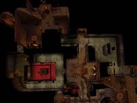
 Layout - Skullduggery is medium-sized. It's easy to get from one side to the other quickly via teleporters. The layout is comprised of a series of linked passages running around two main rooms - the RA room and the central "room with twin stairs". This creates a circuit from RA around to the twin stairs, with a second circuit taking the player from one set of stairs around the back to the other set. A short and narrow passageway to MH runs beneath like a tunnel, with only two entry/exits.
Map Flow - The use of passageways and circuits promotes good speed and flow around the outside circuits, while the central RA room and twin stairs area provides one point where players will have to constantly meet. There are a number of neat touches, such as teleporter exit points providing options for sudden attack.
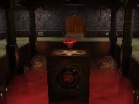
 Control - Gameplay focuses on the RA room. It has three entry points, one of which is via teleporter. The RA is also situated in an open and vulnerable location - on a column surrounded by "fog of death" - making you have to pay a price to get it. There is a YA tucked away in the opposite end of the map, so your opponent has an opportunity to mount a counter-attack. The MH is also near the YA and the teleporter to RA is in that part of the map as well. Maintaining control over both RA and MH is not going to be an easy task.
Weapons - RL, LG, Rail, Plasma Gun and the Shotty.
Armor - 1 each RA and YA. 16 Shards.
Health - 3 Green Orbs, 5 Yellow Orbs and 1 Gold Orb.
Powerups/Items - 1 MH.
Author's Comments - A major part of our mapping project is to understand what forces are at work that influence or restrict how players interface with the pieces authors build. To help direct player comment I asked DieharD to describe his approach to basic design elements:
What are the key concepts underlying this design?
Pretty basic, interconnectedness, smooth flow, strategic item layout. Item layout is important - a good map has to be interconnected a lot and have good flow with areas where you can pull crazy cool moves. Also, generally for any 1v1 map there are 2 sides, very interconnected.
What sort of gameplay are you looking for?
I havent have a chance to think of all possible strategies on it. I'm really interested to see what people will come up with playing my map.
Basically, the map is split up in to two sides by the two armours providing each player with a side to recuperate, take a defensive position and plan a sneak attack. RL is a bit out of the way, however it's pretty simple to steal, because there are 3 ways in and out to it and they all lead there from different parts of the map. RL would be a definite asset in close battles and long distance check shots. Rail will be a good weapon choice for the long distance shots across the hallways.
What suggestions did your playtesters make?
I worked with lantern and citizen from clan abuse. We discussed pretty much every single item placement on the map and I made decisions based on those discussions. For example, the Lightning Gun was put on the map to counter balance the rail gun.
Did you base this design on any "principles"?
Pretty simple principle that I mentioned earlier in the interview, two sides where each has its own advantages (item and layout wise).
The Bottom Line -
This map is already getting the "thumbs-up" from experienced players so it's well worth a look. The vibe I'm getting is that is has depth and subtlety. After you've had a go at it, why not stop back by and give some constructive feedback. We value your input as well. Comments generated here, and on subsequent maps we present, will help further define baseline design considerations for our in-house mapping project. Thanks.
- Miiimiiic
- Despiiise
- Old School
- Prophecy
- No Class!
- Body of DOOM
- Heavy Duty
- Skullduggery
- Ministry of Death
-