Challenge:
News
Forums
Features
Interviews
Pro Mode
CPM Arena
Maps
People
Smackdown
Columns:
Hoony 10 Dec
Mr.CleaN 24 Jun
twoAM 23 Aug
Wiebo de Wit 08 Aug
Jude 19 Jun
![]()
| Latest News | Introduction | Classic Views | Reviews |
Thursday, 17 August 2000 -
Masterpiece of Mayhem ? 1 comment
"twoAM" | r_tourney8c.zip | 1.2 MB | 17.08.00 | Duel | site |

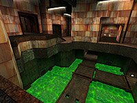
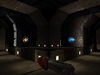
Description One central room with tight side passages and slime at the bottom makes up this small duel map. A catwalk leads over the slime and the general placement of rooms and corridors brings the thoughts back to "A Bad Place" (q1dm4). A yellow armor is located in the central room, and the RA is placed in a small room that requires you to either rocket-jump back or go through a teleporter that leads you down to the catwalk. Rocket launcher and megahealth is located in a dead end at slime-level.
Playing this map against an aggressive player is no easy task. Control is gained by good armor management and keeping the opponent away with rockets and grenades. The teleporters are located so you never really can tell where your opponent will appear. This map is really great and favors players with good reflexes and prediction skills.
Author's Comments - A major part of our mapping project is to understand what forces are at work that influence or restrict how players interface with the pieces authors build. I asked twoAM to describe his approach to basic design elements:
What are the key concepts underlying this design?
I started with something much like a basic version of q1dm4. The upper level was more vertically varied, with the doorway to the RA at the top. The teleporters were all reciprocated. There was no yellow armor. I'd been playing a lot of CPM1 and CPM3 and really liked the in and out of cover style of those maps so I added a bunch more cover. I flattened the upper level a lot to make for better rl and gl action. I ran around and looked for cool trick jumps and added ledges to make some of them possible. I made the teleporters one way to speed things up a bit, make the attacks more dramatic and higher stakes. I tried to add two paths where q1dm4 had only one. So this map has two ways out of the mega/rl room, two ways from the bottom level to the top, two ways to the red armor room... Whenever there are two ways there is the fast way and the alternative way, trying to guess which way your opponent is going/thinks your going is one of my favorite things about tourney.

What sort of gameplay are you looking for?
I wanted to make something that would play more like the quake world demos I had been watching. I wanted lots of grenade spamming, surprise rocket jump sneak attacks, and around the corner rocket shots. I wanted the action to go slooow, sloooow, slooow, really fast, sloow. I think its important to vary the intensity of the action. Some maps like q3tourney4 are relentless, there is almost never a moment of sleathy manuevering. When I watch demos on that map after a while I just start to space off. All the action is really fast but after a while it doesn't seem that fast at all because theres no variation. When you watch Laker vs Kane on q1dm4 and q1dm6, there are lulls and then there are moments of explosively fast attacks. That was more exciting to me.
What suggestions did your playtesters make?
[2ur]Dr.Nick suggested the ledge above the yellow armor and the stairs going up there. Khaile suggested some changes pictured here: http://forums.challenge-network.com/Forum2/HTML/000062.html. RooS and A|Citizen suggested trying a version that was 20 percent larger. People in the beta forums at LvL suggested all kinds of things http://www.planetquake.com/lvl/beta/betacomments.asp?id=263 a couple of which I incorporated.
Did you base this design on any "principles"?
Well there are some principles I follow in all my maps. I draw a simple top down representation of the map on a piece of paper once its done and figure out where to put the health, ammo, and shards from that (and sometimes even weapons and armor). I vary the shard groups and the ammo groups. I try and make the item groups distinctive so its easier to remember what is where. I test the map in r_picmip 5 with no filtering and try and make sure I have enough color variation and enough 3D detail in each area. I limit myself to a small group of textures that go well together so that the entire map feels cohesive.
Weapons - 2 RLs, 1 GL, 1 LG and 1 SG
Armor - 1 YA, 1 RA and 3 shards
Health - 7 25-health
Powerups/Items - 1 megahealth.
- Miiimiiic
- Despiiise
- Old School
- Prophecy
- No Class!
- Body of DOOM
- Heavy Duty
- Skullduggery
- Ministry of Death
-