Challenge:
News
Forums
Features
Interviews
Pro Mode
CPM Arena
Maps
People
Smackdown
Columns:
Hoony 10 Dec
Mr.CleaN 24 Jun
twoAM 23 Aug
Wiebo de Wit 08 Aug
Jude 19 Jun
![]()
| Latest News | Introduction | Classic Views | Reviews |
Sunday, 07 May 2000 -
Ministry of Death ? 11 comments
"Snotman" | kmltourney1.zip | 4.73MB | 05.03.00 | Duel | site |
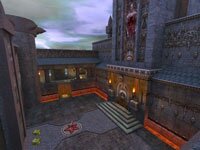
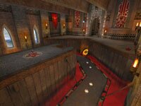
 Architecture - The premise for this piece appears to be an ill-omened cathedral. Massive ornamented spires and a main facade overlook the meditation garden. Covered galleries flank the garden winding their way to the interior of the structure. Worshippers can also use a large operating door in the main facade for more direct access. These three routes open to a spacious central nave, replete with vaulted ceiling, ambulatory and the Fog of Death for those who wish to ignore the collection plate.
Lighting and Texture - Visual contrast is solid as you move from stark steel tones in the garden to a more subdued torchlit brimstone haze in the interior. Sourced, ambient and transitional lighting mesh seamlessly throughout. Tetxure selection is kept to a decent minimum providing a consistent, believeable scheme.
 Performance - Brushwork appears to be quite economical. Still, the polys present a realistic model of the selected subject. Detailed constructions and curved surfaces are sparse but used effectively to help convey a real-world feel to the piece while keeping your processor off its knees. Use of clippers is just about right allowing you to explore, although you'll encounter a slight hitch entering the single teleporter. FPS numbers were good so expect great performance. (Screens courtesy of Snotman)
Weapons - RL, LG, Rail, Plasma Gun and the Shotty.
Armor - 1 each RA and YA. 4 Shards.
Health - 2 Green Orbs and 6 Yellow Orbs.
Items - 1 Personal Teleporter along with alternating Haste and Regeneration runes.
Author's Comments - A major part of our mapping project is to understand what forces are at work that influence or restrict how players interface with the pieces authors build. To help direct player comment I asked Snotman to describe his approach to basic design elements:
How did you approach the architecture?
As usual KMLTOURNEY1 never turned out the way I expected. I did however have a clear idea of what kind of gameplay I wanted when I started; a mixture of open courtyard, tight hallway and platform and jumppad action. Aesthetics was important to me too as I try to build maps that have gameplay AND looks, in that order.
Gameplay is primarily what steered my choice of design but I also had to make a number of large layout changes to keep the gameflow balanced and for other technical reasons. The teleporter was added to make the gameflow more circular and to give anyone trying to hold the main platform in the hall something to think about.
What about weapon/items selection and placement?
Unlike some tourney maps, I wanted to include most of the weapons to allow players to use their strongest weapon and pick the "right tool for the gib err ... job"=). The RL in the middle of the courtyard forces players out in the open to get that staple weapon. The RG is placed where it can nicely cover the main hall and the platform with the powerups.
Ammo is placed to force players to move around the level to get it. The two small health items in the YA room were placed there as an audible cue for player location, and the Personal Teleporter also acts in this way and adds another dimension to gameplay.
Did you "build in" any play directing features?
Wherever possible I tried to avoid situations that created unfair advantages, with the possible exception of hiding on top of the Jesus statue=). I hoped that the two levels and platforms in the main hall would generate some nice RG action.
Any intangibles or extras?
I wanted to add palpable atmosphere to the game so I added some new "horror" sound fx and the "big evil dude" game commentary. The latter can be quite amusing at times when you've just nailed your opponent bigtime and the big guy gives out a good old belly laugh!
The Bottom Line -
The author's done a great job all-round building this map and I think it's a solid candidate for competitive play. I urge you to grab it and give it a spin. After you've had a go at it, why not stop back by and give some constructive feedback. We value your input as well. Comments generated here, and on subsequent maps we present, will help further define baseline design considerations for our in-house mapping project. Thanks.
- Miiimiiic
- Despiiise
- Old School
- Prophecy
- No Class!
- Body of DOOM
- Heavy Duty
- Skullduggery
- Ministry of Death
-