Challenge:
News
Forums
Features
Interviews
Pro Mode
CPM Arena
Maps
People
Smackdown
Columns:
Hoony 10 Dec
Mr.CleaN 24 Jun
twoAM 23 Aug
Wiebo de Wit 08 Aug
Jude 19 Jun
![]()
| Latest News | Introduction | Classic Views | Reviews |
| Heavy Duty - Original Story and Comments (13) | ||
Wednesday, 28 June 2000 -
Heavy Duty ? 4 comments
"Mr.CleaN" | mrcq3t3.zip | Fileplanet Mirror | 1.38MB | 29.06.00 | Duel | site |
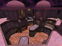
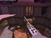
 Layout - Heavy Duty is is comprised of two large, interconnected courtyards. Despite it's size, you can get from one side to the other quickly via teleporters or by just "running around the corner". The larger courtyard has a RG and a YA, and the smaller one has a RL, a YA, a MH, and a LG. There are strong vertical features, with three levels and two turrets (with cool windows) overlooking the action. The ground floor has pillars and water and there are some really interesting stairs.
Map Flow - Each courtyard has raised walkways around the edges and platforms or bridges jutting out into the centre. Connected by passages and teleports, your opponent can suddenly appear from several possible directions. The map promotes speed and provides plenty of room for manoeuvring. It also offers extremely large spaces.
 Control - Gameplay focuses on the RG, due to the open architecture. However, the MH, RL, LG and one of the two YAs are all in the "smaller" of the two courtyards making this an area which is attractive to control. The second YA is tucked away in a corner of the RG room, making it a vulnerable destination for the respawned player. MH is out in the open and requires a RJ to put you back in command.
Weapons - RL, LG, Rail, GL and two Shottys.
Armor - 2xYA. 12 Shards.
Health - 4x25H, 6x5H.
Powerups/Items - 1 MH.
Author's Comments - A major part of our mapping project is to understand what forces are at work that influence or restrict how players interface with the pieces authors build. I asked Mr.CleaN to describe his approach to basic design elements:
What are the key concepts underlying this design?
I wanted a design that felt a bit more open than most duel maps, but still allowed plenty of cover and options. There is a lot of freedom of movement, and plenty of opportunity for some choice RJ'ing.
What sort of gameplay are you looking for?
I'm hoping the design lends itself to interesting gameplay. There are plenty of options as far as verticality and flow. The opportunity exists for both a strategic game as well as some fierce firefights. What should they be doing? Kicking each other's ass!
What suggestions did your playtesters make?
Actually, this was not as bad as I anticipated. They liked they layout and design right off, and no changes were requested in that area. The major changes came in the weapon placement. Originally, the RL was at the RG, the RG was at the GL, and the GL was at the RL. The error in such placement was that both of the top favored weapons (RL and RG) were in the same area, and the RG was on the top floor in a campable position. We also made some minor adjustements to health placement, adding the 25H's on the bottom floor and switching the 50H for a MH. We also switched out a 25H on the top floor by the plat to a 5H for balance.
Did you base this design on any "principles"?
The basic theme I went for here was that of a utilitarian arena. As it's name implies, heavy duty. A place that was built to stand up to the abuse of deathmatching, and while not ugly, not overflowing with unnecessary detail. I stuck with some of the basic principles, ie: make it vertical, always more than one way in and out of an area. I also took care to make each item grouping unique for pickup sounds. I'd heard comments from various people that also inspired me to do the Q1-like sky and the slipgate-style teleporters (though with a more Q3-ish texture).
Playtester's Comments - Next I asked a|citizen to tell us about the thoughts underlying the changes he recommended:
Citizen's thoughts:
When I first saw Heavy Duty the architecture really impressed me, but I noted some flaws with item placement. I ran around the map several times to get a feel for the possibilities of gameplay flow. Because of the open areas on the map, the RG is the most dominant overall weapon, but there are several locations where the LG or the RL would be preferred. The map is basically broken into two large rooms that are connected via two pairs of teleporters and three corridors. My gameplay goal to reach with the final map version was to make one room just a bit more valuable than the other without making the map runnable.
Initially the RG and RL were both on the larger side of the map while the LG and the GL were on the other. Both YAs and SGs were in the same position as the final version. The Mega was only a 50 health. Playing on this first release showed that one person could simply sit on the RG/RL side of the map controlling both weapons plus a YA and easily win.
Since I was very pleased with the architecture of the map and the placement of the armors, the first step was to move the weapons. No weapons needed to be added or removed since the ones chosen were ideal. We left the RG on the larger side of the map but moved it to a lower position. We placed the GL on that end along with it. This allowed us to put the RL and LG together on the smaller end of the map where they are more effective. The only other major change was to covert the 50 health into a Mega to add even more value to the non-RG side of the map (and throw in an added power struggle item to shift the balance of the map a bit and make the RG player move more). Minor changes beyond that were simply some ammo, health, and shards adjustments.
After much playtesting the map's gameplay ended up very much like I envisioned it. The design promotes fast and furious action while stealth and suprise are rewarded as well. The overall map is not controllable but some of the key elements are. I look forward to playing this map in future tournaments. :)
Finally, I must say that it was a very positive experience working with Mr.Clean. He is very talented and was totally open to my suggestions. I plan on and look forward to helping him out with future maps in any way I can. I think we learned alot from each other.
Citizen of Team Abuse
http://www.teamabuse.com/
The Bottom Line -
Heavy Duty is a map unlike anything you have probably seen before. It's size and openness are refreshing, and the "two rooms" provide a lot of strategic focus to the gameplay. This will produce some very exciting and interesting games indeed. If you would like to provide direct feedback to please feel free to do so. Thanks.
- Miiimiiic
- Despiiise
- Old School
- Prophecy
- No Class!
- Body of DOOM
- Heavy Duty
- Skullduggery
- Ministry of Death
-